How to Choose Quilt Colors: Color Schemes, Value and Fabric Tips
Choosing quilt colors is the step many quilters find hardest, and the one that makes the biggest difference to the finished quilt. The good news is that it follows a few simple principles. This guide explains why value matters more than color, the classic quilt color schemes, how to build a palette from one fabric you love, and how to test your choices before you cut.
Value matters more than color
Value is how light or dark a fabric is. It is what makes a quilt pattern visible. Two fabrics in completely different colors but the same value will blur together, while a light and a dark fabric in the same color family will show the pattern clearly.
- Include lights, mediums and darks. A quilt with only medium values often looks flat.
- Put the strongest contrast where you want attention, such as star points or the diagonal of a log cabin block.
- Check value with a photo. Take a picture of your fabrics and switch it to black and white. If two fabrics look the same gray, they will read as one in the quilt.
Quilt color schemes from the color wheel
The color wheel gives reliable starting points for quilt color schemes:
Monochromatic
Several shades of one color, from very light to very dark. Calm and elegant, and value does all the work.
Analogous
Three or four colors next to each other on the wheel, such as blue, teal and green. Harmonious and easy to live with.
Complementary
Two colors opposite each other, such as blue and orange or red and green. High energy and strong contrast. Let one color lead and use the other as an accent.
Split complementary
One color plus the two colors on either side of its opposite, such as blue with red-orange and yellow-orange. Lively but less harsh than a straight complementary scheme.
Triadic
Three colors evenly spaced around the wheel, such as red, yellow and blue. Bright and cheerful, ideal for children’s quilts.
Two-color quilts
One color plus a background, such as navy and white or red and cream. Two-color quilt blocks look crisp and graphic, and the pattern always reads clearly.
Quilt color schemes at a glance
| Scheme | Colors | Mood | Example |
|---|---|---|---|
| Monochromatic | One color, many values | Calm, elegant | Light to dark blues |
| Analogous | Neighbors on the wheel | Harmonious | Blue, teal, green |
| Complementary | Opposites | Bold, energetic | Navy and orange |
| Split complementary | One color plus two near its opposite | Lively, balanced | Blue, coral, gold |
| Triadic | Three evenly spaced | Bright, playful | Red, yellow, blue |
| Two-color | One color plus background | Crisp, graphic | Red and cream |
How to choose quilt colors step by step
- Start with a focus fabric. Pick one print you love and pull the palette from its colors. The designer has already balanced them for you.
- Choose a background. White, cream, gray or a dark solid. The background sets the mood and gives the blocks room to breathe.
- Use the 60-30-10 idea. Roughly 60% main color or background, 30% secondary color and 10% accent.
- Vary the print scale. Mix large prints, small prints, tone-on-tones and solids so fabrics do not compete.
- Check the values with a black and white photo.
- Add a surprise. A small amount of an unexpected color, such as a touch of chartreuse in a blue quilt, often brings the whole palette to life.
Using a quilt color palette generator
Online color palette generators can turn a photo into a set of colors, which is a fun way to find a palette from a landscape, a painting or a room. Use the result as a guide, then match it with real fabric, since screen colors are never exact.
Test your quilt colors on a design wall
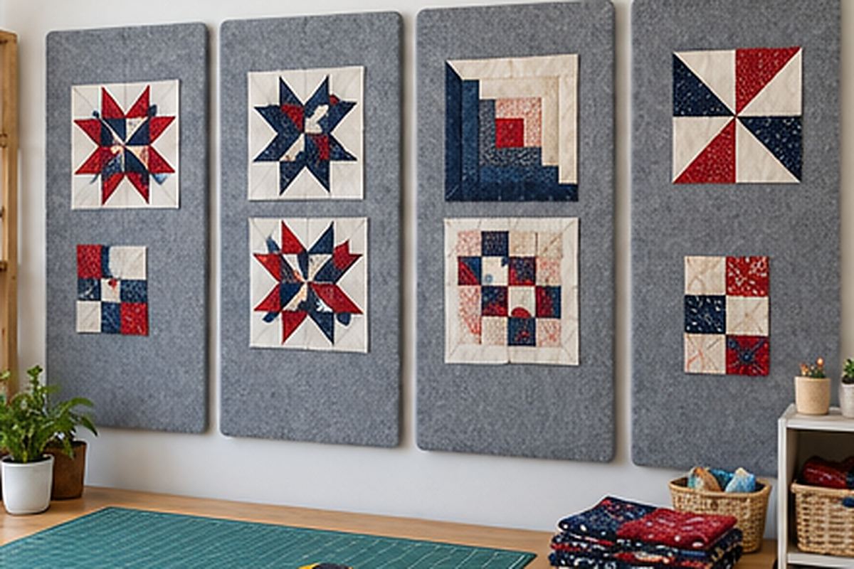
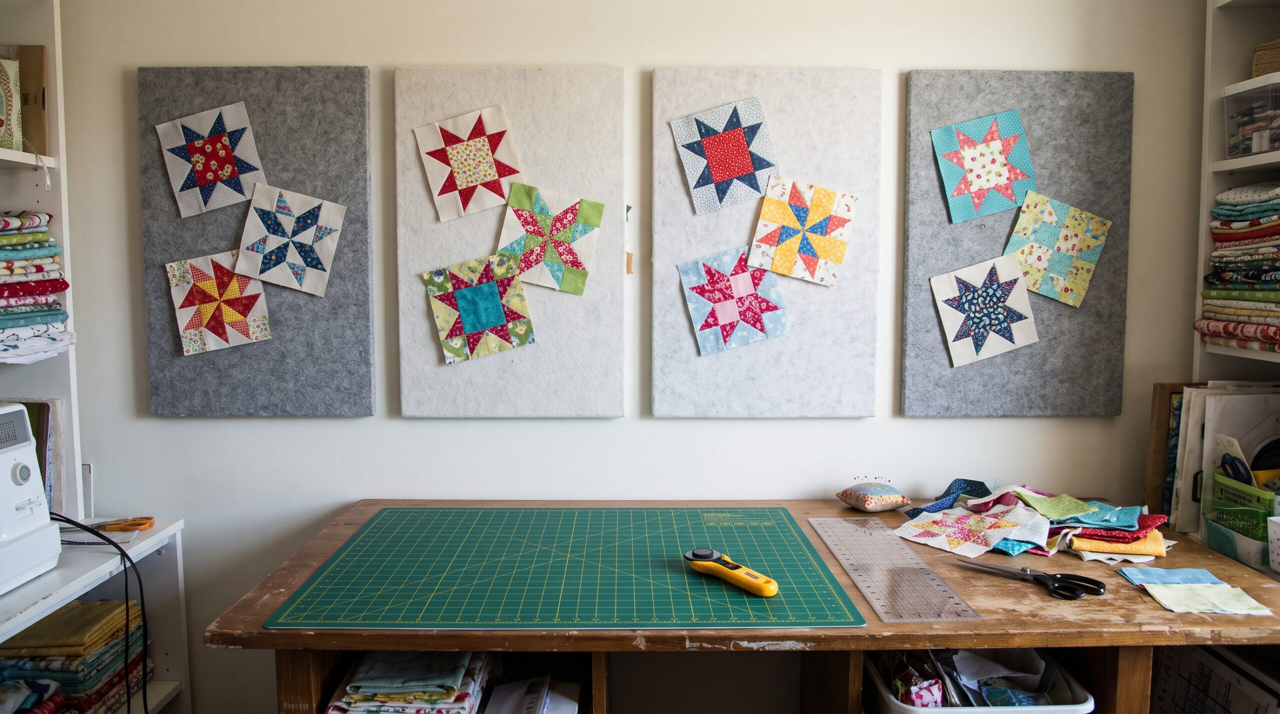
Fabric looks different in a stack, on a screen and in a finished quilt. A quilt design wall lets you see colors at full scale and under the light you will actually live with.
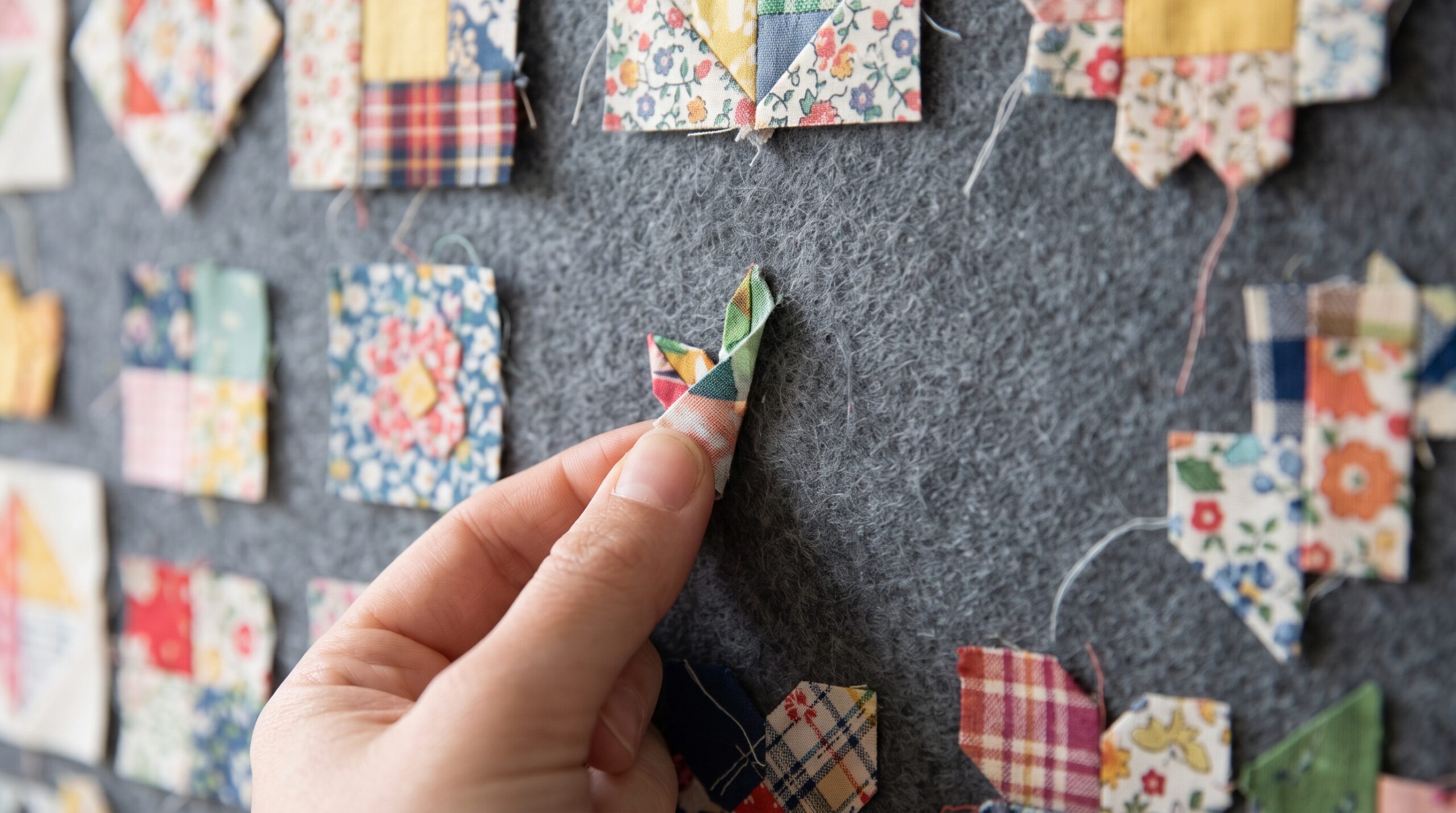
- Pin up swatches or test blocks of every fabric. Flannel holds them without pins.
- Step back several feet. Colors that look fine up close may disappear or overpower from across the room.
- Take a black and white photo to check value contrast.
- Swap out the weakest fabric and compare again.
- Rearrange finished blocks so colors are spread evenly across the quilt.
For a full quilt, the large quilt design wall shows every block at once, and quilt design wall tiles are handy for auditioning fabrics in a small space. Once your palette is set, explore quilt layouts and easy quilt blocks, or plan the whole quilt with our guide on how to design a quilt.
Frequently asked questions
How many colors should a quilt have?
There is no fixed number. Many quilts use three to five colors plus a background. More important than the number is a good range of light, medium and dark values.
What is value in quilting?
Value is how light or dark a fabric is compared with the fabrics around it. Contrast in value is what makes a quilt pattern visible.
What colors go well together in a quilt?
Colors next to each other on the color wheel look harmonious, and colors opposite each other look bold. Choosing a focus print and pulling colors from it is the easiest way to find colors that work together.
What background color is best for a quilt?
White and cream give a fresh, classic look, gray is modern and soft, and dark backgrounds such as navy or black make bright colors glow. Choose the background that gives the most contrast with your blocks.
How can I test quilt colors before cutting?
Put swatches or test blocks on a design wall, step back several feet and take a black and white photo. This shows both how the colors work together and whether there is enough value contrast.
Tags